Cambridge Design Partnership - Mosiac
First Digital Designer · 0→1 · 2021 – 23
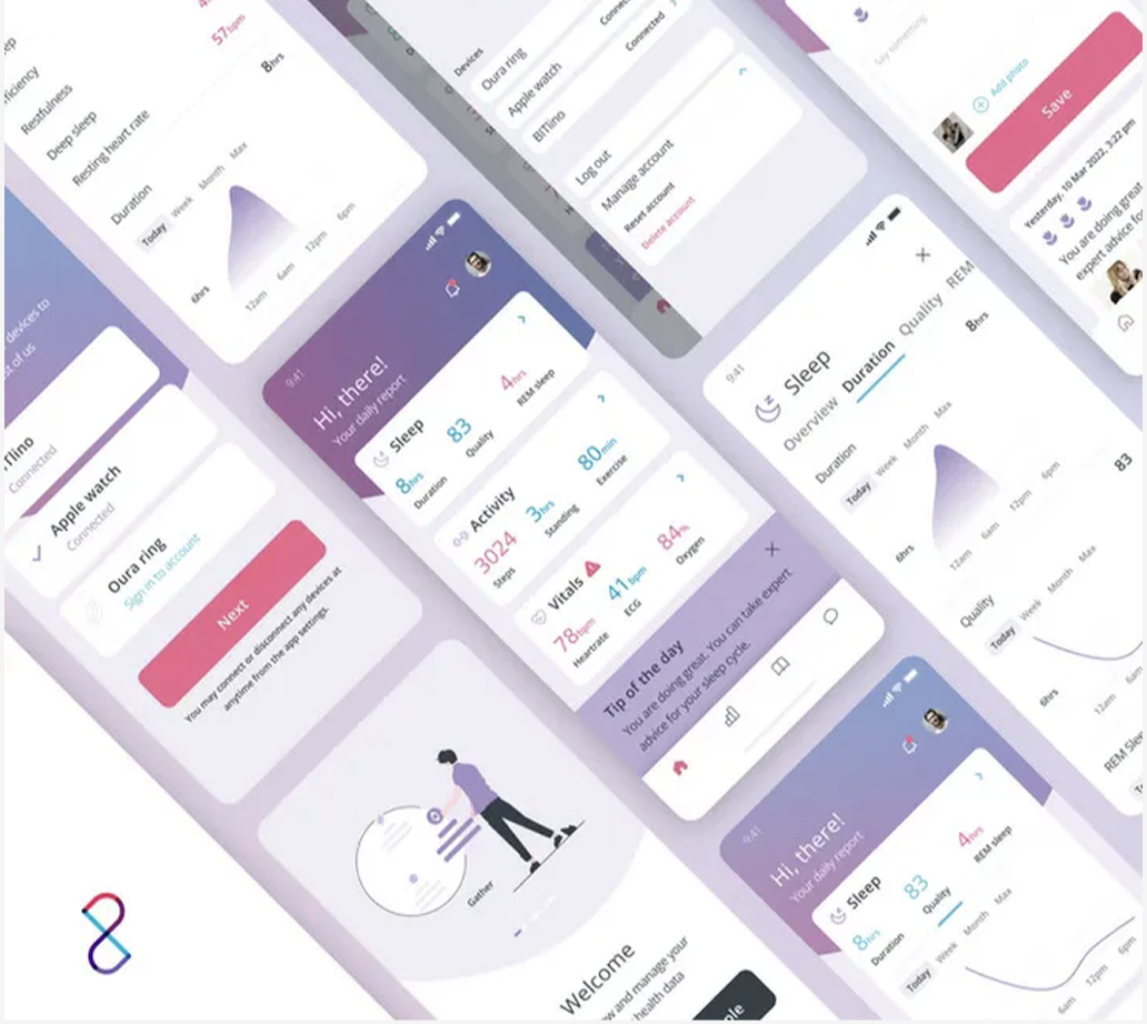
Making health data glanceable — a 0→1 mobile app framework for a medical-device consultancy, designed once and reusable across client products.
Cambridge Design Partnership engineers physical medical devices; digital was a growing arm, and I was its first and only designer. My brief was to build a flexible health-app framework from scratch — demonstrated through an app which connects devices, daily health scores, trends and sleep insights.
Every client project was starting from zero: no shared patterns, no component base, no answer to "how do we show health data without alarming people?" Health metrics arrive as isolated numbers — steps, heart rate, sleep stages — that mean little on their own and can read as frightening without context.
A health number on its own doesn't help people. It needs context: compared with what, is it good or bad, and what should I do about it?
The framework has two audiences: the patient who uses the app every day, and the device maker who gives it to them as a companion to their product. Example used here: a long-acting HIV injector.
Daniel, 34
I want to stay on track without my phone telling everyone what I'm being treated for.
- Never miss an injection window
- Feel in control of his treatment
- Keep his condition private
- Health apps that feel clinical or alarming
- Notifications that reveal too much on a lock screen
- Repeating the same details to every clinic
- Discreet app name and neutral reminders
- Next-dose countdown and simple injector pairing
- Easy side-effect log he can share with his clinic
Maya, Digital Product Lead
We need a companion app at launch, but we can't build and certify a new one for every device.
- Improve adherence, the main selling point of a long-acting treatment
- Get to market quickly with their own branding
- Collect usage data as evidence for clinicians and payers
- Building a custom app from scratch for each device
- Medical regulation and data-privacy requirements
- Inconsistent experience across their product range
- White-label theming and configurable modules
- Built-in Bluetooth device pairing
- Privacy and compliance patterns designed in
Proto-personas, based on the project brief and team knowledge rather than formal interviews.
First and only digital designer: the framework's information architecture, wireframes, component library and visual language — plus stakeholder collaboration through release, marketing and branding of the final app.
I mapped the full product as low-fidelity wireframes first:
Alongside them I defined the IA, key task flows and a starter component library. Interactive prototypes were reviewed with stakeholders and iterated through feedback sessions.
- 01Design a framework, not an app — every pattern had to survive a different device, user or clinical context.
- 02Opinionated defaults in the modular system, so screens compose instead of becoming debates.
- 03Calm visual language — reassurance over drama for health data.
- 04Visual trends over isolated metrics: one daily score, then progressive disclosure into detail.
A reusable digital foundation for the consultancy — the Mosiac Health app shipped as its proof, and the framework's patterns, components and health-data language became the starting point for subsequent client products. Scalability designed in at the wireframe stage made the eventual product work faster, not slower.
Designing a framework is different from designing one app. Every decision had to work for a different device, patient and client, so I spent more time on rules and defaults than on individual screens.
With health data, how something is said matters as much as what is shown. Calm language and context made the same numbers feel reassuring instead of worrying.