Greyparrot
Lead Designer · End-to-end + handoff · 2023 – 24
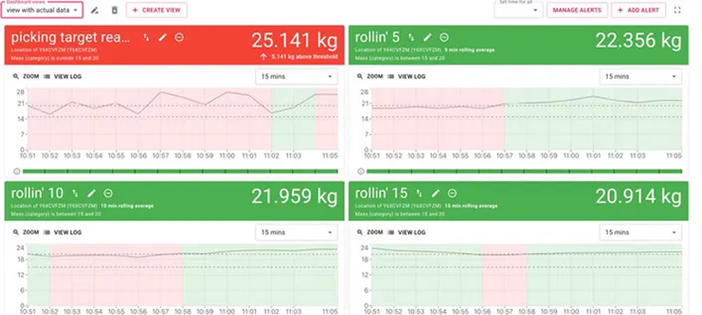
Redesigning the alerts dashboard for an AI waste-analytics platform — cutting alert noise so recycling-plant operators can act on real deviations, at a glance, from across the room.
Greyparrot puts AI vision on waste-sorting lines, turning conveyor-belt footage into live composition analytics. Plant operators monitor it on a tablet hanging on the factory floor. I was the lead (and only) designer — responsible for end-to-end design through developer handoff — and the Alerts module was the most important surface for end users.
Plant operators on shift: standing, moving between machines, often in gloves, in a loud environment, checking a tablet mounted on the floor from a distance. They have seconds, not minutes, to decide whether an alert needs action.
Operators were drowning in noise: roughly 120 alerts a shift, most of them false alarms from absolute thresholds that ignored each stream's natural rhythm. Status wasn't legible from two metres away, so deviations were spotted late — and the alert feed had trained people to dismiss rather than act.
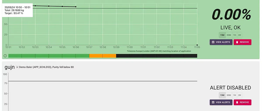
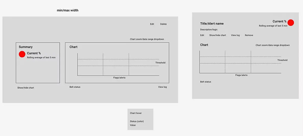
Sole designer on the redesign — discovery workshops with stakeholders, field research with operators, wireframes, the final visual system and developer handoff. Every design call from information architecture to threshold logic ran through me.
Stakeholder workshop to map pain points, in-context research on the factory floor, then wireframes tested with real operators before high fidelity. The guiding reframe: not "show more data" but "surface the right deviation at the right moment."
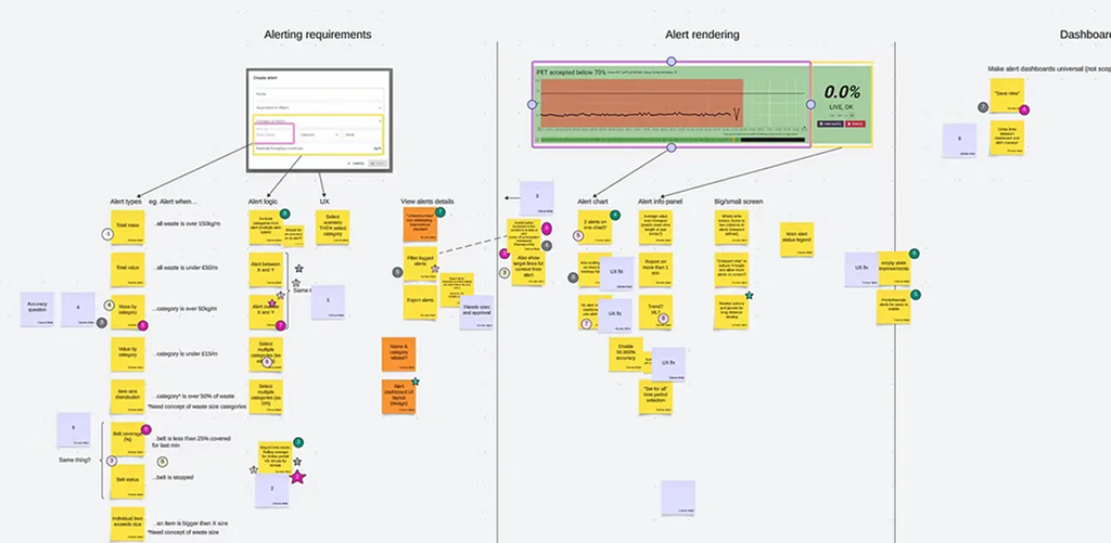
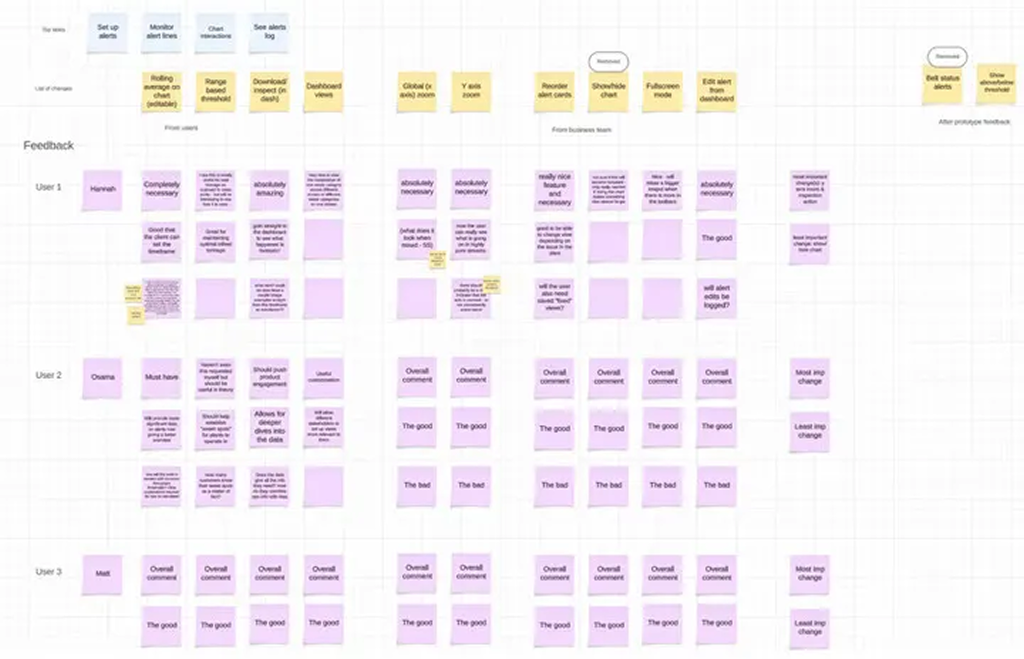
Operators weren't missing alerts because there were too few. They were missing them because there were too many. When most alerts are false, people learn to dismiss all of them, including the real ones.
- 01Thresholds relative to each stream's own baseline, not absolute numbers — killing most false alarms at the source.
- 02Glanceability as a feature: type scale and colour carry the status, density demoted.
- 03Design for the hanging tablet first — readable from two metres, mid-shift, gloves on.
- 04Alert-to-action ratio over alert volume as the measure of a healthy feed.
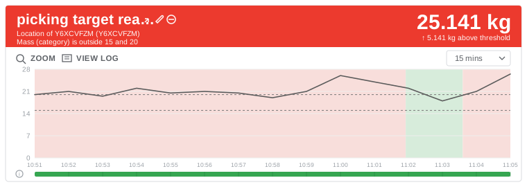
Every normal peak crosses the line. 3 alerts, 2 false.
The band follows the stream's rhythm. 1 alert, and it's real.
Diagram illustrating decision 01.
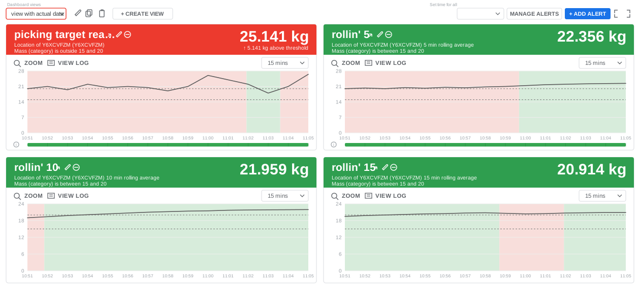
Success was defined against the three goals that shaped the redesign: alerts reaching an operator cut from ~120 to under 40 a shift, over 60% of surfaced alerts acted on rather than dismissed, and correct status readable from two metres in under three seconds — measured through product analytics, moderated usability tasks and in-context observation on the tablet. The update shipped publicly as the Analyzer Alerts release.
An alert system is only as useful as the trust people have in it. Cutting the noise mattered more than adding information, because every false alarm made the next real one easier to ignore.
Designing for the factory floor also meant testing where the product is used. Distance, gloves and noise changed decisions that looked fine at a desk.